
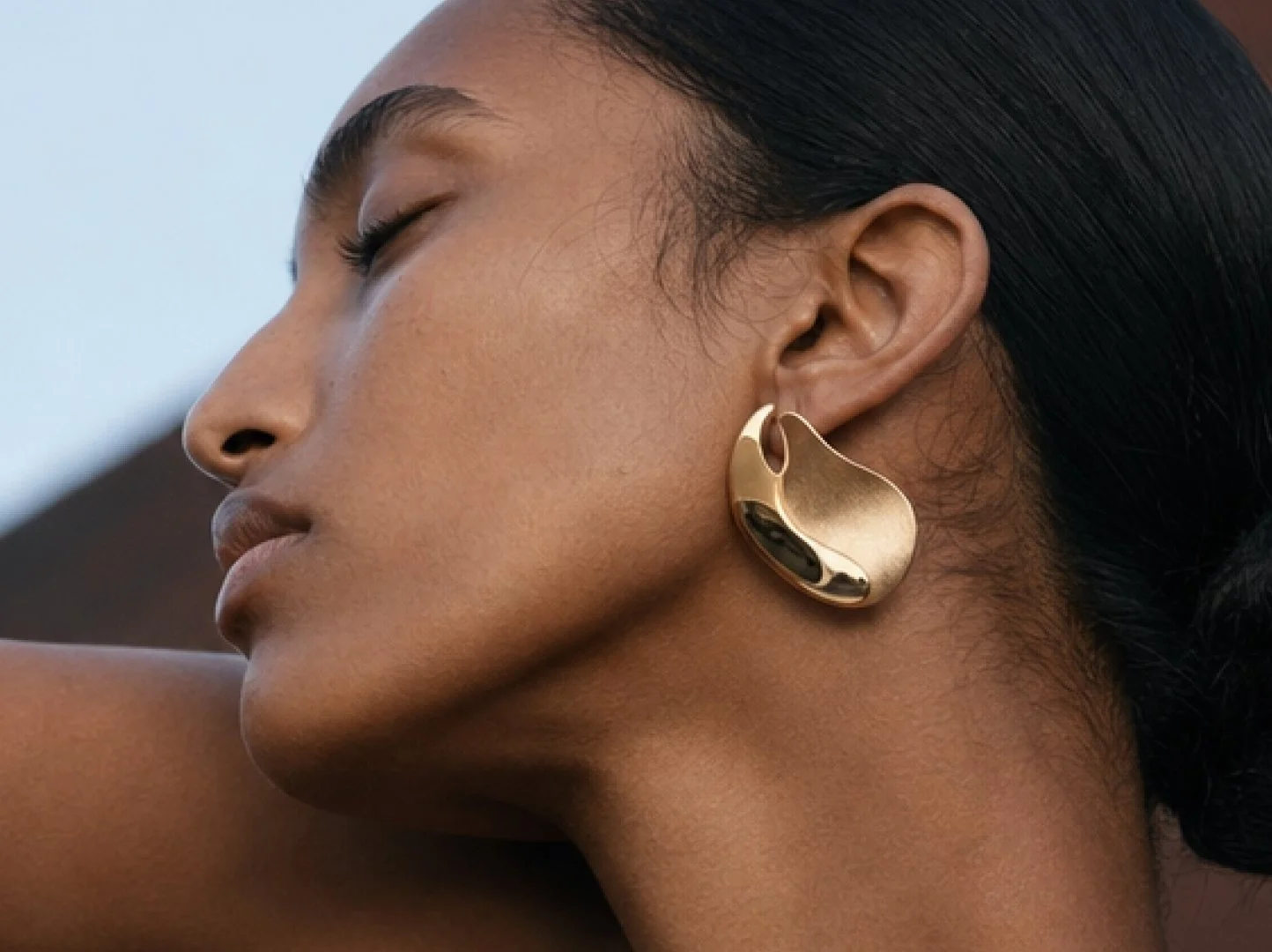
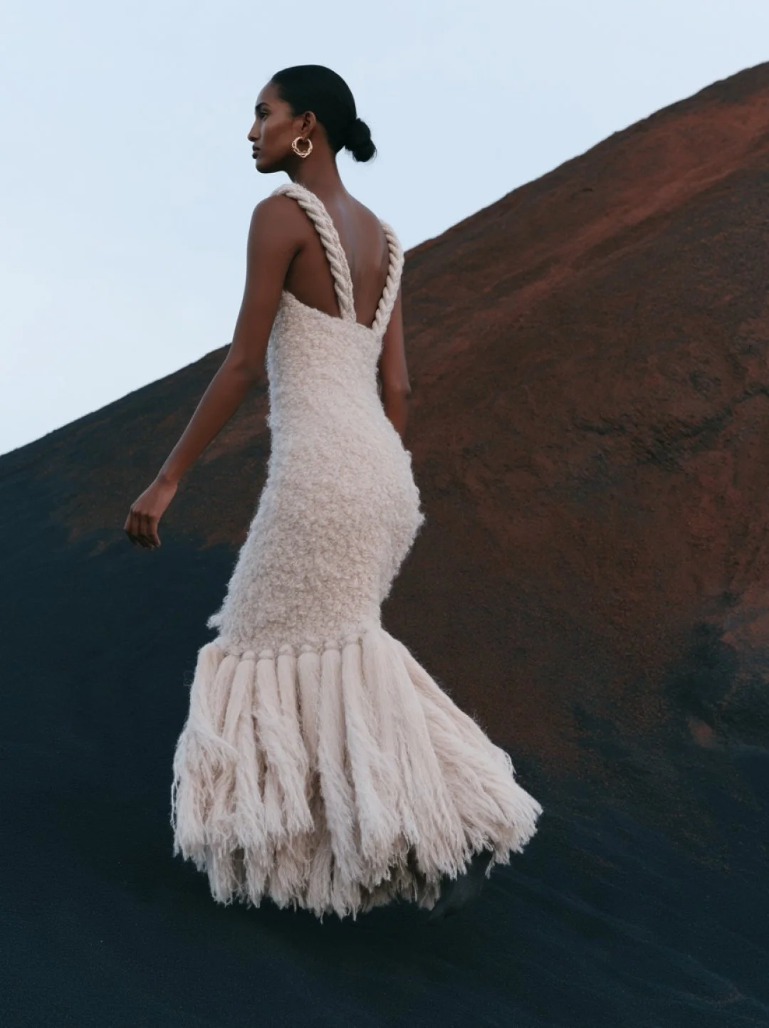
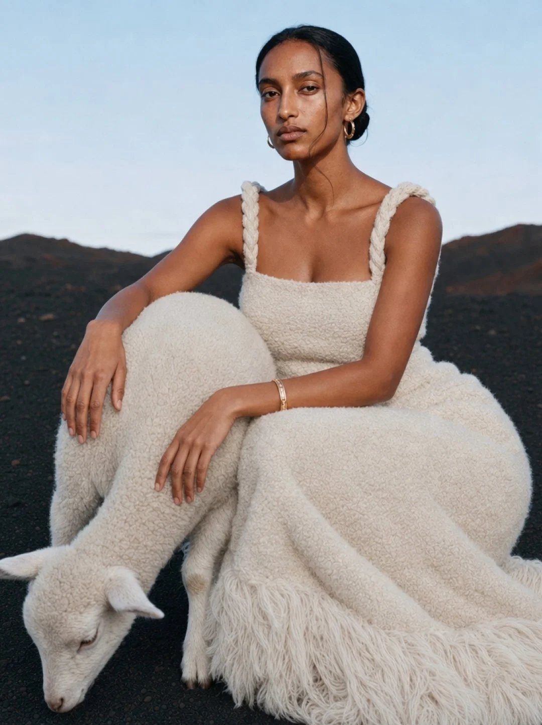
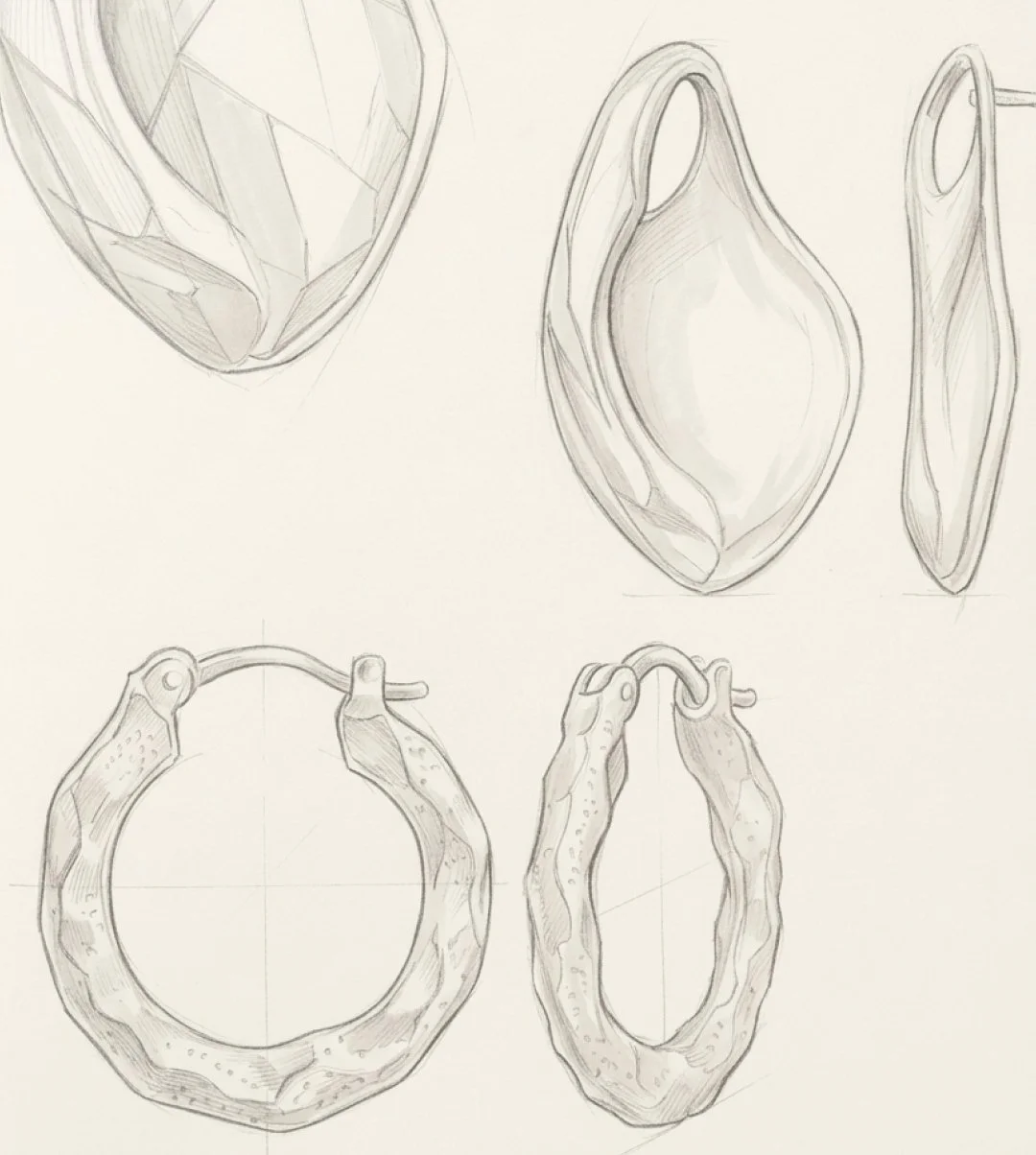
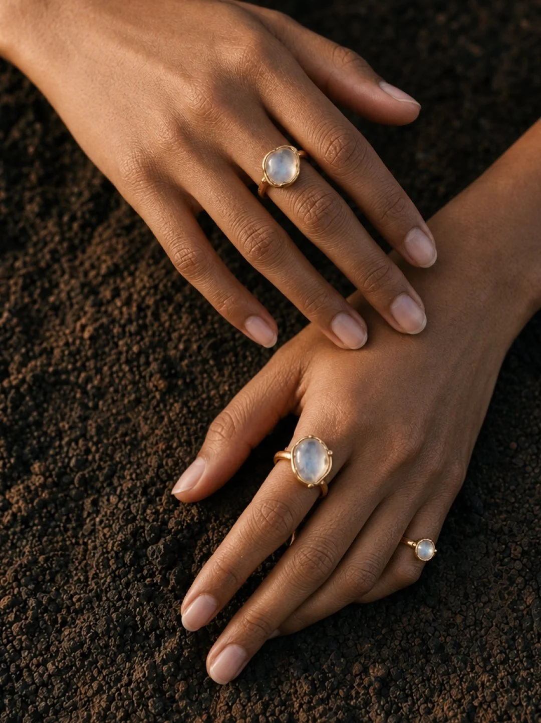

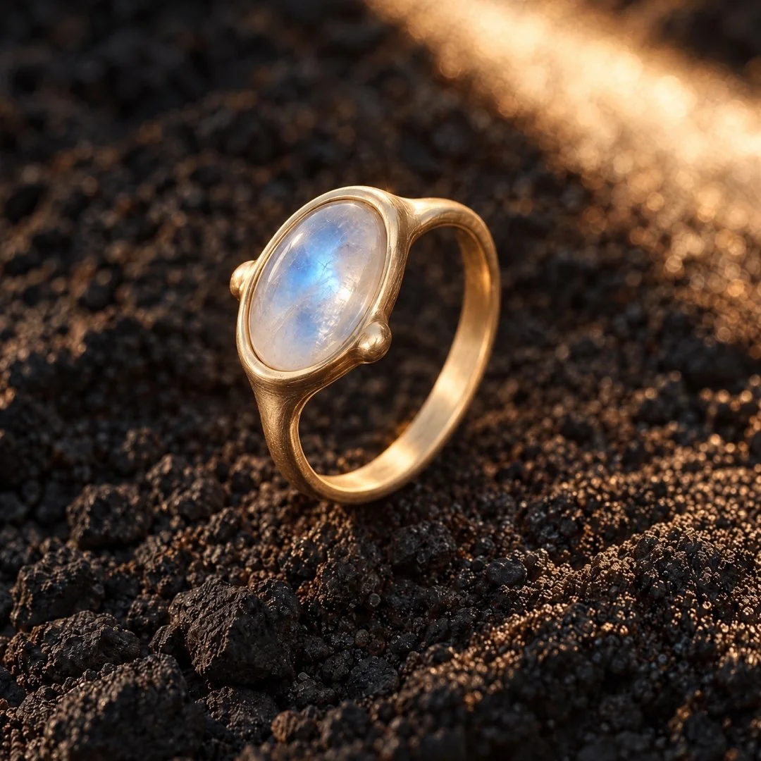
For a self-initiated jewelry concept, I built a visual metaphor around how fine metalcraft is actually made. The aim was to show that a brand without the budget for an international photoshoot doesn’t have to settle for flat studio images or generic stock. With art direction and AI-generated imagery, directed with intention, a bespoke visual world can be built around the product itself.
The concept places handcrafted gold and silver jewelry in a volcanic landscape: dark, raw and elemental, a reference to the fire and pressure it takes to shape precious metal. Unbleached wool adds a quiet warmth that lets the metal shine, and stands for what remains when everything else has burned away.
The result is a set of images for website and social media that belong to one world.
CREATED WITH: AI-generated imagery, art direction by me
MY TASK: Visual concept development / Art direction / Visual world for website and social media

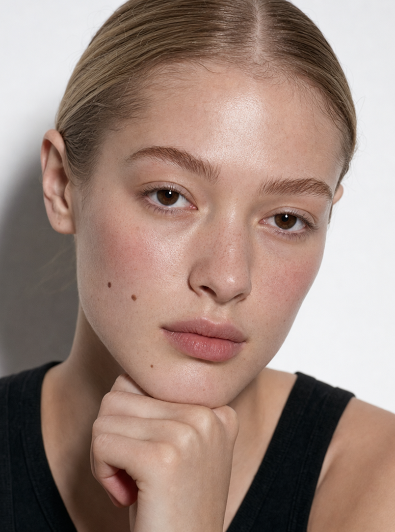
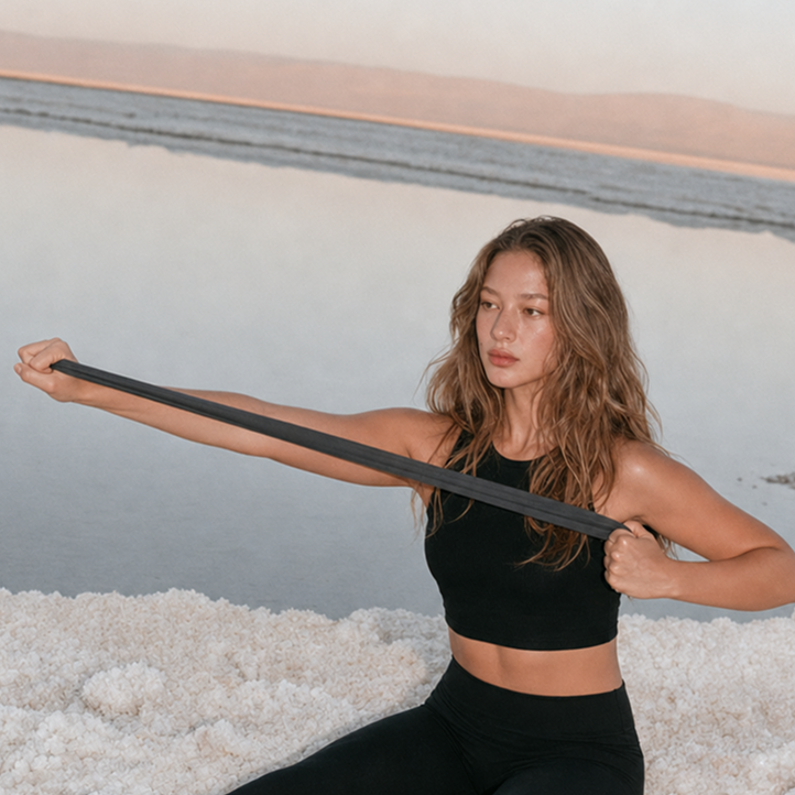
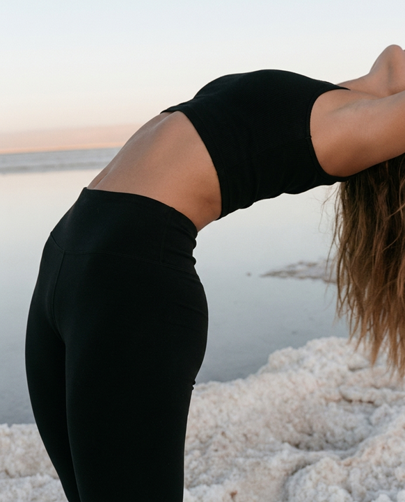
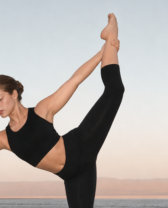
I looked at what is usually left out of wellness imagery. The default is the aspirational end result: the flawless pose, the sterile lighting, the effortless finish. When the process is hidden, the images stop feeling real. This concept shows both sides.
The story follows Xin, my AI-created avatar, through a full spectrum of movement. Composed, aligned poses are paired with sudden, flashed snapshots, so the quiet discipline and the unscripted effort appear in the same world.
The salt lake is a visual anchor that ties the body back to its essential elements: salt as the foundation of sweat, endurance and effort. Providing a visual contrast for the black work-out wear.
CREATED WITH: AI-generated imagery, art direction by me
MY TASK: Visual concept development / Art direction / Visual world for website and social media

For the launch of Wella Professionals’ haircare range for curly and wavy hair, a campaign concept titled “Free Your Curls” was developed. Rooted in consumer insight, the campaign addressed the lack of representation and the unique challenges faced by individuals with textured hair—often feeling the need to hide, control, or compromise their natural curls. The message celebrated liberation, self-expression, and care.
The creative direction was brought to life through a visual metaphor of a protected rooftop garden, where models nurture a variety of plants—each symbolizing different curl types. This elevated setting represents both the nourishing effect of the products and a sense of escape from daily pressures. Positioned above the city, it embodies freedom, self-care, and pride in natural beauty.
CLIENT: Wella Professionals
AGENCY: Select World
MY TASK: Campaign visual concept development / Creating ideas for always-on content / Art direction for social media content / Post production supervision
For the launch of Guhl’s new care range for dry and damaged hair, featuring the on-trend ingredient prickly pear oil, an integrated campaign was developed spanning TVC, print, and social media. The concept was rooted in a dreamlike visual world typical of the brand, inspired by an Alice in Wonderland-style journey. The model is portrayed as a modern-day explorer, discovering a transformative, nourishing solution for her hair.
Shot within an extraordinary architectural location, the setting symbolized the intersection of nature, modernity, and minimalism. The prickly pear ingredient was featured in a refined, artistic manner, with oil and water splashes used to enhance the sensorial expression of nourishment. Dynamic hair shots introduced a natural, real-world contrast, highlighting both the fantasy of the campaign and the tangible results of the product.
CLIENT: Guhl
AGENCY: Select World
MY TASK: Art direction for social media content and the three special effects scenes for the TVC / Ideas for social media content / Layout for print advertising
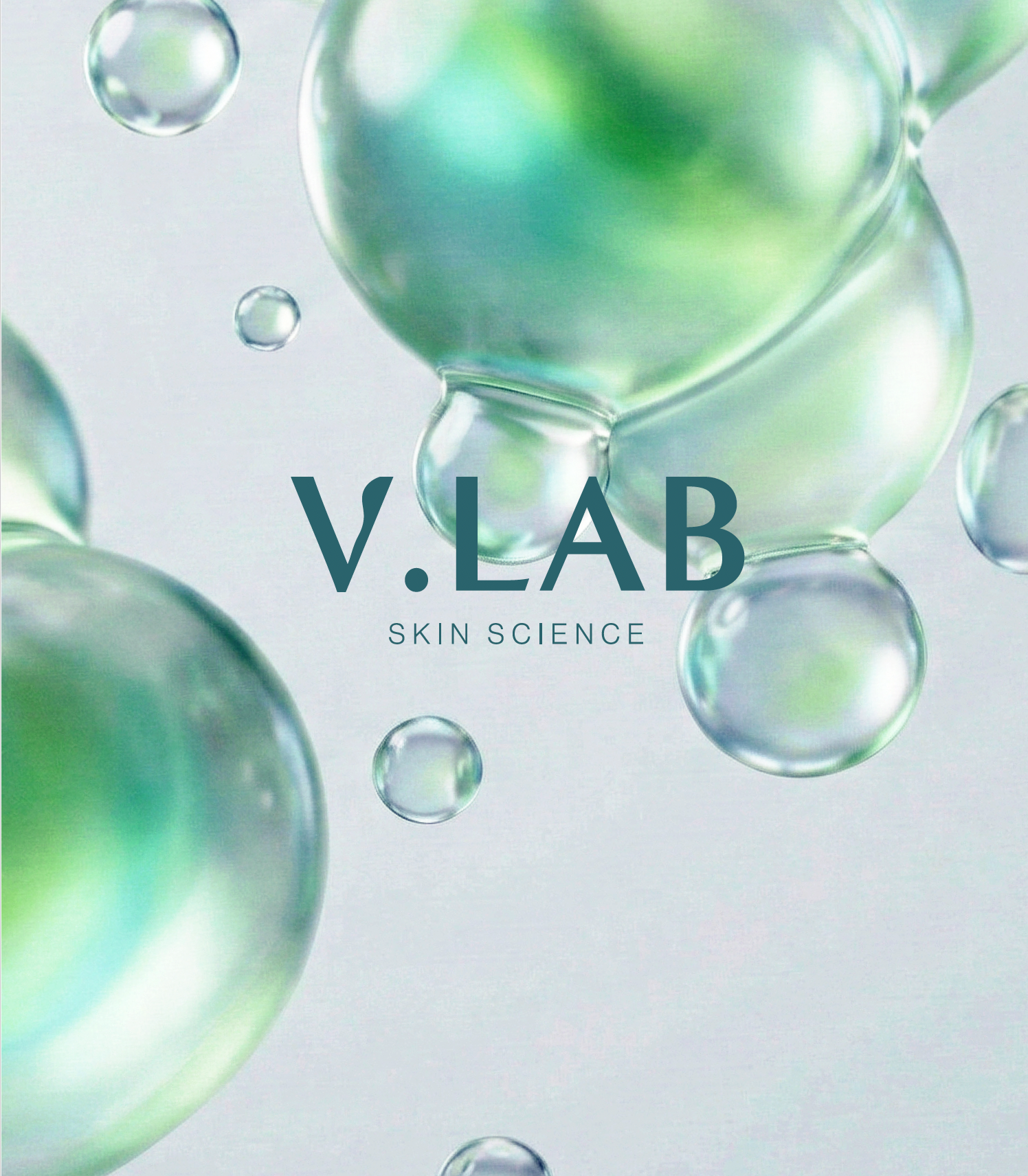
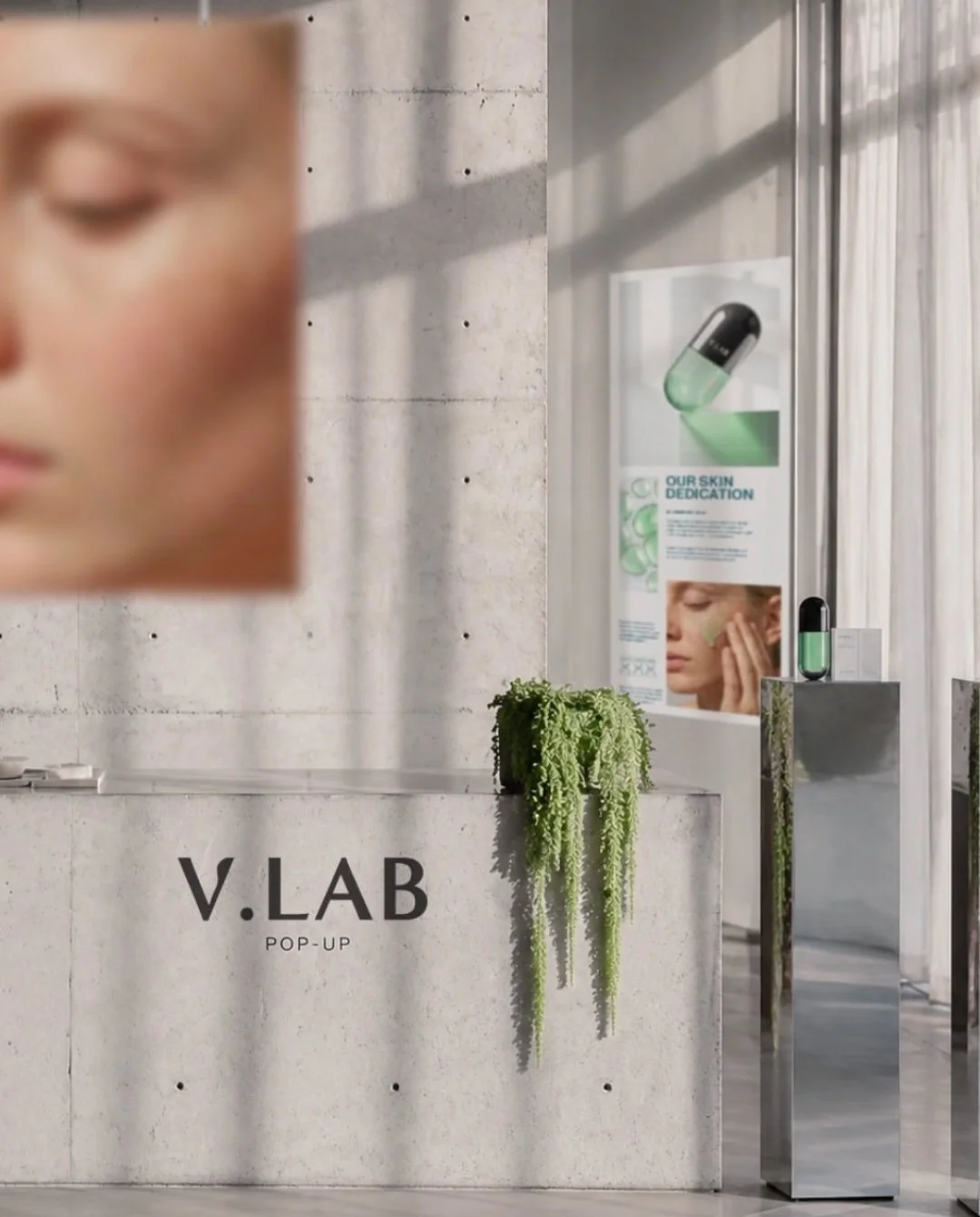
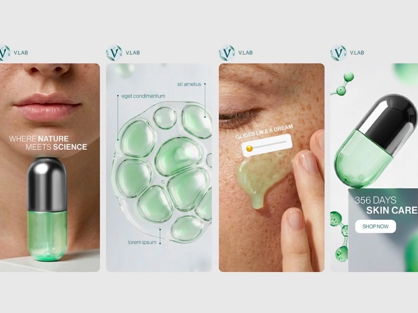
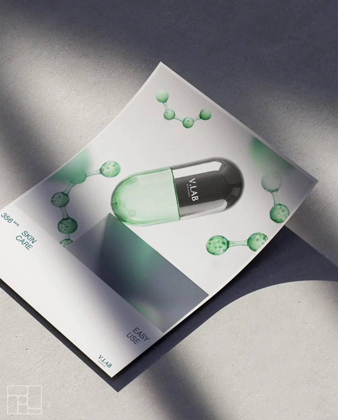
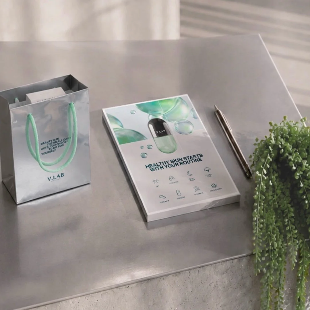
I created a fictional clinical cosmetics brand, “V.Lab” and explored how one creative system can stretch across stills, motion, social content and a pop-up store. A visual system proves itself when it works beyond a single image and holds together as one world.
Although the brand is rooted in clinical skincare, I deliberately avoided the expected all-white aesthetic. Concrete gives a sense of strength and trust. Mirrored surfaces bring elegance, depth and movement. Organic elements soften the setting and balance science with nature, so the brand feels alive and not sterile.
The result is a brand experience that stays recognisable at every touchpoint, from the first image to the physical space.
CREATED WITH: AI-generated imagery, art direction by me
MY TASK: Visual concept development / Art direction / Visual world for website and social media
This project involved the transition of a "simple logo" request into a deep, conceptually-driven brand identity for a hospitality revenue expert. The work was rooted in a strategic discovery process—using positioning, vision, and persona mapping to bridge the gap between rigorous financial data and intuitive astrological guidance.
The visual direction was built around the concept of the eclipse, symbolizing alignment and the brand's role as a guide during pivotal business transitions. This was executed through a balance of authoritative typography and an organic mark, featuring a subtle "hidden star".
In parallel, this direction was translated into a comprehensive suite of professional assets—including a LinkedIn visual strategy, business cards, and bespoke offer letter templates. The result is a cohesive, brand-consistent ecosystem that elevates the brand from a standard service provider to a trusted authority, ensuring every client touchpoint reflects quiet confidence and long-term credibility.
CLIENT: Bright Coaching
MY TASK: Brand Identity / Concept Development / Design system
This projects covers the creation of a comprehensive set of global materials for Wella Professionals, aimed at both salon professionals and end consumers. For hairdressers, the focus was on designing visually engaging and easy-to-follow educational tools such as step-by-step guides and look books, that clearly communicated new haircutting techniques and color trend applications. In parallel, a series of posters and in-salon displays were developed to translate these trends into aspirational visuals for clients, bridging technical education with consumer inspiration in a cohesive, brand-consistent manner.
CLIENT: Wella Professionals
AGENCY: Select World
MY TASK: Layout creation for different assets / Editorial design / Graphic design
In addition to the campaign assets, I developed the design guidelines used across global markets. These guidelines defined the core visual rules, template logic, and adaptation principles, enabling local teams to implement the campaign consistently while allowing for market-specific needs.
CLIENT: Wella Professionals
AGENCY: Select World
MY TASK: Creation of design guidelines / Layout development / Editorial design


To accompany the launch of two new ice cream flavours and a volume update for the classic vanilla variety, a comprehensive 360° campaign was developed under the slogan “Der Genuss ist nur einen Löffel entfernt.” The campaign centered around authentic, relatable moments shared with one’s “family of choice”—highlighting how indulgence can be both emotional and sensory.
A distinctive visual cue was introduced in the form of a “spoon trick,” where one spoon reveals multiple others sliding in behind it—symbolizing an open invitation to share indulgence with others. This playful and inviting gesture was used across TVC and TrueView formats, reinforcing the message of togetherness. The result was a visually and emotionally layered and multi-sensory campaign that celebrated indulgence as a shared and deeply personal pleasure.
CLIENT: Cremissimo
AGENCY: Oliver Agency
MY TASK: Concept co-creation for 360° campaign / Story ideas for main TVC, 3 trueview ads and 4 bumper ads / Art direction / Pre production development / Post production supervision / Layout development for Link ads and print ads
Tasked with addressing low performance in the DACH region, a strategic workshop uncovered a core issue: although targeted at men, Men Expert’s communication appealed primarily to women—featuring dreamy celebrities that didn’t resonate with a male audience.
To shift the narrative while staying true to the L’Oréal Paris brand, the campaign adopted the line “Because she is worth it,” reflecting the insight that men often care for themselves out of love for others. A relatable local celebrity, combining traits like sport, music, cars, and fatherhood was cast to embody this more authentic narrative. The campaign, built with warmth and self-aware humor, launched across TV, digital, and print. In parallel, media placement was strategically redirected toward male relevant environments such as sports and car magazines, and a suggestion that brand presence should be extended into barber shops where the products would be integrated into grooming services.
CLIENT: L’Oréal Paris
AGENCY: McCann Erickson Düsseldorf
MY TASK: Concept co-creation for relaunch campaign / Story ideas co-creation for TVC
This project focused on shaping the social media presence for both Rexona and Bombay Saphire through the development of tailored content strategies. Core tasks included defining content pillars and crafting thumb-stopping visuals designed to inform, entertain, or inspire the audience. Each piece of content was created to align with the brand’s tone while also enhancing motivation and emotional connection and invite into the brands world. Visually, the approach emphasized bold, grid-friendly layouts that ensured a cohesive and engaging experience across platforms.
CLIENT: Rexona & Bombay Saphire
AGENCY: Oliver Agency
MY TASK: Always-on content development / Ideas co-creation / UGC content / Product & Reel shootings


Exploring AI as a creative partner, I use Midjourney, Nano Banana, Higgsfield and other AI tools to transform emotion, material, and intuition into visually intelligent concepts that merge art direction with innovation.
Glass Skin: Inspired by the movement of light, I visualized the feeling of glass skin, luminous, and turned sensory emotion into storytelling.
Tools & Texture: A study in minimal elegance, exploring the interplay of form, texture, and shadow to create refined visual tension showcasing various makeup tools.
Fermented Heritage: Rooted in my Bulgarian culture, I reimagined skincare storytelling through warmth, fermentation, and elevated natural beauty.
Modern Skin: Exploring contemporary beauty through quiet confidence — minimal gestures, bare skin, and honest light.
AI EXPERIMENTAL WORK